Emmitt's 2004 season with the Cards was pretty impressive actually. That O line was fucking terrible. He ran hard most of the year and broke a lot of tackles. In many ways he was better that year than his last few with the Cowboys.Iholdthepain wrote:That Cardinals detour was pretty sad, though, especially when Roy Williams of the Cowboys broke Emmitt's shoulder with a killer hit in the middle of the field, circa 2003.
Lament's Uniform Aesthetics Thread...
-
nyquillyn
- Misplaced My Sponge
- Posts: 5825
- Joined: Tue January 01, 2013 2:11 pm
Re: Lament's Uniform Aesthetics Thread...
-
Iholdthepain

- Future Drummer
- Posts: 3096
- Joined: Wed February 26, 2014 12:08 am
- Location: the afterlife...
Re: Lament's Uniform Aesthetics Thread...
Oh, for sure. It was just sad to see him go to another team at the end of his career, a'la Tony Dorsett and Mike Modano... and to later sign a one-day contract so he could officially retire a Cowboyturned2black wrote:Emmitt's 2004 season with the Cards was pretty impressive actually. That O line was fucking terrible. He ran hard most of the year and broke a lot of tackles. In many ways he was better that year than his last few with the Cowboys.Iholdthepain wrote:That Cardinals detour was pretty sad, though, especially when Roy Williams of the Cowboys broke Emmitt's shoulder with a killer hit in the middle of the field, circa 2003.

-
Kaius
- I've been POOSSTTIiiEEnngeeaahh
- Posts: 11136
- Joined: Fri November 15, 2013 6:14 am
Re: Lament's Uniform Aesthetics Thread...
Love the headbandIholdthepain wrote:It's hard to stay on topic sometimes...Kaius wrote:Yeah, I should have said, "Walter and then everyone else..."Iholdthepain wrote:this statement is ridiculous, considering neither have the rushing title!Kaius wrote:There is Barry and Walter, and then everyone else...
We should talk about this in a new thread. I love the "best rb of all time" debate. I don't want to muck up Laments threads thread.
I liked Walter's Bears uni until Ed started wearing it at EVERY show!

-
darth_vedder

- Misplaced My Sponge
- Posts: 6467
- Joined: Tue January 01, 2013 9:52 pm
Re: Lament's Uniform Aesthetics Thread...
Love those!E.H. Ruddock wrote:

This should definitely be Tampa Bay's uniform:
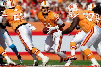
-
darth_vedder
- Misplaced My Sponge
- Posts: 6467
- Joined: Tue January 01, 2013 9:52 pm
Re: Lament's Uniform Aesthetics Thread...
I'm no Giant's fan, but I did like these:
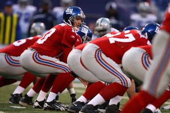
-
Kaius
- I've been POOSSTTIiiEEnngeeaahh
- Posts: 11136
- Joined: Fri November 15, 2013 6:14 am
Re: Lament's Uniform Aesthetics Thread...
I think the giants uniforms have always looked cheap. Eck.
-
Green Habit

- Site Admin
- Posts: 6946
- Joined: Wed December 12, 2012 10:33 pm
Re: Lament's Uniform Aesthetics Thread...
Looks like I missed a lot here, not sure where to start.
-
BigRedLedbetter

- Rank This Poster
- Posts: 5401
- Joined: Sat June 07, 2014 5:38 pm
- Location: The town of Lincoln, Nebraska
Re: Lament's Uniform Aesthetics Thread...
I always think of Steve Young when I see these unis.darth_vedder wrote:Love those!E.H. Ruddock wrote:
This should definitely be Tampa Bay's uniform:
"My balls feels like they're in a French press." ~ bodysnatcher
-
E.H. Ruddock

- Guys, I am not a moderator! I swear to God! Why does everyone think I'm a moderator?
- Posts: 52160
- Joined: Tue January 01, 2013 2:48 pm
-
Lament

- Commissioner
- Posts: 11792
- Joined: Wed March 13, 2013 12:48 am
Re: Lament's Uniform Aesthetics Thread...
Not from the USFL, but I've got a soft spot for the Southern Califorinia Suns uniform from the old WFL in the 70s...E.H. Ruddock wrote:Lament, do you have any favorite uniforms from the old USFL?

TEAM HARMLESS FOREVER...
-
Lament
- Commissioner
- Posts: 11792
- Joined: Wed March 13, 2013 12:48 am
Re: Lament's Uniform Aesthetics Thread...
Just jump right in.Green Habit wrote:Looks like I missed a lot here, not sure where to start.
TEAM HARMLESS FOREVER...
-
Green Habit
- Site Admin
- Posts: 6946
- Joined: Wed December 12, 2012 10:33 pm
Re: Lament's Uniform Aesthetics Thread...
OK, I'll just spit out some semi-random thoughts on the 32 NFL teams for now:Lament wrote:Just jump right in.Green Habit wrote:Looks like I missed a lot here, not sure where to start.
--I miss the Patriots' old uniforms, but the current ones are better than the mid-90s version.
--I don't like the Dolphins' new logo, they never should have changed it.
--I loved it when the Steelers changed the number font to match the font on their helmets
--Bengals' helmet is one of the best in the league
--Both the Ravens and Texans could use a small overhaul, looks too dated to the 90s.
--If I had to pick the team with the worst uniforms and logo, I'd go with the Titans. They really need to change everything.
--Jaguars should have done a completely different logo instead of just tweaking the old one.
--I've been able to live with the Broncos' current style, especially since they brought orange back as the primary color. But the logo desperately needs the D back in it. Rumor has it Bowlen removed it as a passive-aggressive threat to get a stadium deal done or he was moving to Houston.
--I'm probably in the stark minority here but I think the Chargers' powder blues are the most overrated jersey in the NFL, especially when paired with the tacky numbers on the helmets.
--I also think the Raiders' unis are overrated but I'm of course horribly biased.
--I was quite happy when the Giants and 49ers dropped the block fonts for the jersey numbers.
--Eagles could use a font change.
--Even though the Redskins' name and logo may likely change someday I love the burgundy/yellow scheme.
--Everyone in the NFC North has awesome uniforms and shouldn't tinker beyond really timy things like the Vikings and Lions recently did..
--The Bucs' new uniforms are terrible. I thought both the dreamsicles and the Dungy/Gruden era ones were just fine.
--Loved the Seahawks' overhaul when they moved to the NFC. Their latest one, not so much.
--Cardinals are probably the most boring uniforms in the league. This is one team I wouldn't mind see go apeshit on a change.
--Last but not least: if I only had one change I could mandate, I'd make the Rams return the bright yellow to their uniforms. I absolutely despite that mustard gold color they switched to.
I'm sure there's something in there for everyone to disagree on.

-
Green Habit
- Site Admin
- Posts: 6946
- Joined: Wed December 12, 2012 10:33 pm
Re: Lament's Uniform Aesthetics Thread...
Oh, and one more general uniform complaint: there are way too many red/blue/white combinations. Anyone who's thinking of a new palette should steer away from that combo, it's been overdone.
-
Lament
- Commissioner
- Posts: 11792
- Joined: Wed March 13, 2013 12:48 am
Re: Lament's Uniform Aesthetics Thread...
Now THAT'S how you make an entrance!
TEAM HARMLESS FOREVER...
-
darth_vedder
- Misplaced My Sponge
- Posts: 6467
- Joined: Tue January 01, 2013 9:52 pm
Re: Lament's Uniform Aesthetics Thread...
* I think the Eagles should go back to the look. I hate the midnight green / black they currently use.
* One trend I do not like is moving from light blue to navy. It seems like a bunch of teams did it, for example: aThe Chargers, the Broncos, the Patriots, Bills (but they went back to the lighter blue), UVA, etc...It's fine, and nothing against navy blue, I just don't like that a lot of teams switched, and now too many are navy.
* The Bills blue pants with the white jerseys is a sharp look. Maybe my second favorite road uniform in the NFL behind the Chiefs and the red pants / white jersey.
* I typically side on more traditional uniforms, but I like alternates, just not crazy design / stripes / patterns.
* I love Washington's burgundy & gold look. Glad they switched back to this in recent years:
- Spoiler: show

* One trend I do not like is moving from light blue to navy. It seems like a bunch of teams did it, for example: aThe Chargers, the Broncos, the Patriots, Bills (but they went back to the lighter blue), UVA, etc...It's fine, and nothing against navy blue, I just don't like that a lot of teams switched, and now too many are navy.
* The Bills blue pants with the white jerseys is a sharp look. Maybe my second favorite road uniform in the NFL behind the Chiefs and the red pants / white jersey.
* I typically side on more traditional uniforms, but I like alternates, just not crazy design / stripes / patterns.
* I love Washington's burgundy & gold look. Glad they switched back to this in recent years:
- Spoiler: show

-
BigRedLedbetter
- Rank This Poster
- Posts: 5401
- Joined: Sat June 07, 2014 5:38 pm
- Location: The town of Lincoln, Nebraska
Re: Lament's Uniform Aesthetics Thread...
Lament wrote:Not from the USFL, but I've got a soft spot for the Southern Califorinia Suns uniform from the old WFL in the 70s...E.H. Ruddock wrote:Lament, do you have any favorite uniforms from the old USFL?
The Maulers jerseys were great I thought.
"My balls feels like they're in a French press." ~ bodysnatcher
-
numbers

- Mind Your Tanners
- Posts: 9200
- Joined: Tue January 01, 2013 6:44 pm
- Location: Franklin, MA
Re: Lament's Uniform Aesthetics Thread...
This is a huge complaint of mine in baseball, there are only like 5 teams that don't have either blue or red in their scheme.Green Habit wrote:Oh, and one more general uniform complaint: there are way too many red/blue/white combinations. Anyone who's thinking of a new palette should steer away from that combo, it's been overdone.
-
darth_vedder
- Misplaced My Sponge
- Posts: 6467
- Joined: Tue January 01, 2013 9:52 pm
Re: Lament's Uniform Aesthetics Thread...
Not sure what the Cowboys have done in recent years to their pants, but this was a good look that they should go back to:

-
BigRedLedbetter
- Rank This Poster
- Posts: 5401
- Joined: Sat June 07, 2014 5:38 pm
- Location: The town of Lincoln, Nebraska
Re: Lament's Uniform Aesthetics Thread...
I never thought of that.numbers wrote:This is a huge complaint of mine in baseball, there are only like 5 teams that don't have either blue or red in their scheme.Green Habit wrote:Oh, and one more general uniform complaint: there are way too many red/blue/white combinations. Anyone who's thinking of a new palette should steer away from that combo, it's been overdone.
"My balls feels like they're in a French press." ~ bodysnatcher
-
BigRedLedbetter
- Rank This Poster
- Posts: 5401
- Joined: Sat June 07, 2014 5:38 pm
- Location: The town of Lincoln, Nebraska
Re: Lament's Uniform Aesthetics Thread...
I wish I had never sold this on ebay.....

"My balls feels like they're in a French press." ~ bodysnatcher