Lament's Uniform Aesthetics Thread...
-
darth_vedder

- Misplaced My Sponge
- Posts: 6467
- Joined: Tue January 01, 2013 9:52 pm
Re: Lament's Uniform Aesthetics Thread...
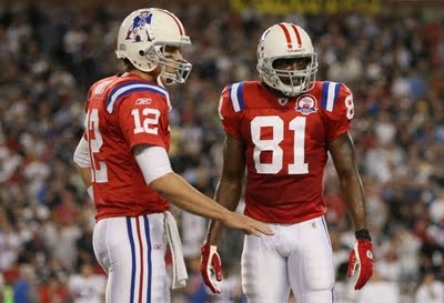
I hate the Pats, but this is probably top 3 throwbacks:
-
numbers

- Mind Your Tanners
- Posts: 9200
- Joined: Tue January 01, 2013 6:44 pm
- Location: Franklin, MA
Re: Lament's Uniform Aesthetics Thread...
I would like the Pats to go to a modernized version of that original uniform. I'm sick of their current scheme, it's always been so generic. I actually prefer the Bledsoe Era uniforms to the current ones, as goofy as that sounds
-
Self

- Polluted
- Posts: 4682
- Joined: Tue January 01, 2013 10:27 am
- Location: PM me, I have everything.
Re: Lament's Uniform Aesthetics Thread...
The early 90s unis were horrible.numbers wrote:I would like the Pats to go to a modernized version of that original uniform. I'm sick of their current scheme, it's always been so generic. I actually prefer the Bledsoe Era uniforms to the current ones, as goofy as that sounds
-
numbers
- Mind Your Tanners
- Posts: 9200
- Joined: Tue January 01, 2013 6:44 pm
- Location: Franklin, MA
Re: Lament's Uniform Aesthetics Thread...
The one they wore in 94 wasn't bad.Self wrote:The early 90s unis were horrible.numbers wrote:I would like the Pats to go to a modernized version of that original uniform. I'm sick of their current scheme, it's always been so generic. I actually prefer the Bledsoe Era uniforms to the current ones, as goofy as that sounds
-
Self
- Polluted
- Posts: 4682
- Joined: Tue January 01, 2013 10:27 am
- Location: PM me, I have everything.
Re: Lament's Uniform Aesthetics Thread...
Better than 93, I guess. I think they should use the new logo with the throwback scheme. At least they'd be able to use the old logo for a game or two per season. :/numbers wrote:The one they wore in 94 wasn't bad.Self wrote:The early 90s unis were horrible.numbers wrote:I would like the Pats to go to a modernized version of that original uniform. I'm sick of their current scheme, it's always been so generic. I actually prefer the Bledsoe Era uniforms to the current ones, as goofy as that sounds
-
BigRedLedbetter

- Rank This Poster
- Posts: 5401
- Joined: Sat June 07, 2014 5:38 pm
- Location: The town of Lincoln, Nebraska
Re: Lament's Uniform Aesthetics Thread...
numbers wrote:The one they wore in 94 wasn't bad.Self wrote:The early 90s unis were horrible.numbers wrote:I would like the Pats to go to a modernized version of that original uniform. I'm sick of their current scheme, it's always been so generic. I actually prefer the Bledsoe Era uniforms to the current ones, as goofy as that sounds

This is my go to Sunday shirt in the fall.....

"My balls feels like they're in a French press." ~ bodysnatcher
-
darth_vedder
- Misplaced My Sponge
- Posts: 6467
- Joined: Tue January 01, 2013 9:52 pm
Re: Lament's Uniform Aesthetics Thread...
Seeing all these throwbacks reminds me that the No Fun League helmet rule thing is stupid. Due to this rule, we won't see the Patriots, Buccaneers, and other teams' throwbacks.
-
darth_vedder
- Misplaced My Sponge
- Posts: 6467
- Joined: Tue January 01, 2013 9:52 pm
Re: Lament's Uniform Aesthetics Thread...
Back to baseball, this is a good look for both teams:

-
Lament

- Commissioner
- Posts: 11792
- Joined: Wed March 13, 2013 12:48 am
Re: Lament's Uniform Aesthetics Thread...
I'm all about this complaint.numbers wrote:This is a huge complaint of mine in baseball, there are only like 5 teams that don't have either blue or red in their scheme.Green Habit wrote:Oh, and one more general uniform complaint: there are way too many red/blue/white combinations. Anyone who's thinking of a new palette should steer away from that combo, it's been overdone.
TEAM HARMLESS FOREVER...
-
E.H. Ruddock

- Guys, I am not a moderator! I swear to God! Why does everyone think I'm a moderator?
- Posts: 52160
- Joined: Tue January 01, 2013 2:48 pm
Re: Lament's Uniform Aesthetics Thread...
Go OriolesLament wrote:I'm all about this complaint.numbers wrote:This is a huge complaint of mine in baseball, there are only like 5 teams that don't have either blue or red in their scheme.Green Habit wrote:Oh, and one more general uniform complaint: there are way too many red/blue/white combinations. Anyone who's thinking of a new palette should steer away from that combo, it's been overdone.
Clouuuuds Rolll byyy...BANG BANG BANG BANG
-
Lament
- Commissioner
- Posts: 11792
- Joined: Wed March 13, 2013 12:48 am
Re: Lament's Uniform Aesthetics Thread...
Orioles, White Sox, Athletics, Rockies, Pirates, Giants, by my count. Eesh. No surprise that everyone on that list besides the Rockies is among the sharpest looking in baseball.E.H. Ruddock wrote:Go OriolesLament wrote:I'm all about this complaint.numbers wrote:This is a huge complaint of mine in baseball, there are only like 5 teams that don't have either blue or red in their scheme.Green Habit wrote:Oh, and one more general uniform complaint: there are way too many red/blue/white combinations. Anyone who's thinking of a new palette should steer away from that combo, it's been overdone.
TEAM HARMLESS FOREVER...
-
philpritchard

- Rank This Poster
- Posts: 4155
- Joined: Thu January 03, 2013 3:45 pm
Re: Lament's Uniform Aesthetics Thread...
I think Toronto, Boston and Cincinnati should get a pass on the colour thing since it's part of their name.Lament wrote:Orioles, White Sox, Athletics, Rockies, Pirates, Giants, by my count. Eesh. No surprise that everyone on that list besides the Rockies is among the sharpest looking in baseball.E.H. Ruddock wrote:Go OriolesLament wrote:I'm all about this complaint.numbers wrote:This is a huge complaint of mine in baseball, there are only like 5 teams that don't have either blue or red in their scheme.Green Habit wrote:Oh, and one more general uniform complaint: there are way too many red/blue/white combinations. Anyone who's thinking of a new palette should steer away from that combo, it's been overdone.
-
numbers
- Mind Your Tanners
- Posts: 9200
- Joined: Tue January 01, 2013 6:44 pm
- Location: Franklin, MA
Re: Lament's Uniform Aesthetics Thread...
That's why I found it sad when the Marlins and Rays went away from their old color schemes. Especially Tampa, that green was unique.Lament wrote:Orioles, White Sox, Athletics, Rockies, Pirates, Giants, by my count. Eesh. No surprise that everyone on that list besides the Rockies is among the sharpest looking in baseball.E.H. Ruddock wrote:Go OriolesLament wrote:I'm all about this complaint.numbers wrote:This is a huge complaint of mine in baseball, there are only like 5 teams that don't have either blue or red in their scheme.Green Habit wrote:Oh, and one more general uniform complaint: there are way too many red/blue/white combinations. Anyone who's thinking of a new palette should steer away from that combo, it's been overdone.
-
philpritchard
- Rank This Poster
- Posts: 4155
- Joined: Thu January 03, 2013 3:45 pm
Re: Lament's Uniform Aesthetics Thread...
The Marlins new colour scheme is still unique, at least. I liked the teal and black, though.numbers wrote:That's why I found it sad when the Marlins and Rays went away from their old color schemes. Especially Tampa, that green was unique.
Is there a worse logo in sports right now than this?

-
doug rr
- The Master
- Posts: 27510
- Joined: Tue January 01, 2013 3:45 pm
- Location: I'm now Canadian..go broncos
Re: Lament's Uniform Aesthetics Thread...
I've been a rockies fan since day one but I have never bought any merchandise because I hate purple
-
numbers
- Mind Your Tanners
- Posts: 9200
- Joined: Tue January 01, 2013 6:44 pm
- Location: Franklin, MA
Re: Lament's Uniform Aesthetics Thread...
Those home whites are an abomination.philpritchard wrote:The Marlins new colour scheme is still unique, at least. I liked the teal and black, though.numbers wrote:That's why I found it sad when the Marlins and Rays went away from their old color schemes. Especially Tampa, that green was unique.
Is there a worse logo in sports right now than this?
-
@SkitchP

- RM Elitist
- Posts: 9995
- Joined: Tue January 01, 2013 8:43 pm
Re: Lament's Uniform Aesthetics Thread...
Keep in mind though most baseball teams have been around for more than 100 years, and secondary colors weren't discovered until 1924.
dimejinky99 wrote: Hang on I check on my Grindr
-
E.H. Ruddock
- Guys, I am not a moderator! I swear to God! Why does everyone think I'm a moderator?
- Posts: 52160
- Joined: Tue January 01, 2013 2:48 pm
Re: Lament's Uniform Aesthetics Thread...
Good point. Weren't all uniforms some variation of black and white until the 50's?@SkitchP wrote:Keep in mind though most baseball teams have been around for more than 100 years, and secondary colors weren't discovered until 1924.
Clouuuuds Rolll byyy...BANG BANG BANG BANG
-
Green Habit

- Site Admin
- Posts: 6946
- Joined: Wed December 12, 2012 10:33 pm
Re: Lament's Uniform Aesthetics Thread...
Weren't the A's also red/blue/white until Chuck Finley gave them his trademark palette?Lament wrote:Orioles, White Sox, Athletics, Rockies, Pirates, Giants, by my count. Eesh. No surprise that everyone on that list besides the Rockies is among the sharpest looking in baseball.
-
Lament
- Commissioner
- Posts: 11792
- Joined: Wed March 13, 2013 12:48 am
Re: Lament's Uniform Aesthetics Thread...
Yep. And the White Sox always had red or blue in their identity until 1991. The Pirates actually used to be red, white, and blue too, I believe.Green Habit wrote:Weren't the A's also red/blue/white until Chuck Finley gave them his trademark palette?Lament wrote:Orioles, White Sox, Athletics, Rockies, Pirates, Giants, by my count. Eesh. No surprise that everyone on that list besides the Rockies is among the sharpest looking in baseball.
TEAM HARMLESS FOREVER...