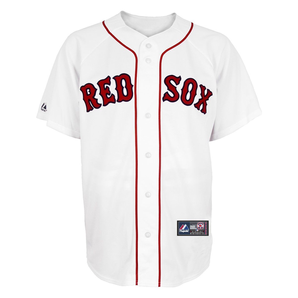
Monkey_Driven wrote:On the subject of uniforms, I loved the throwbacks Oregon wore last year.
Damn. Those are fucking great.
PHATJ wrote:
The Twins might be my second-least favorite team in all of baseball, but this a really good looking uniform. I normally am not a fan of navy and red, but the powder blue makes it work for me.
Strat wrote:I just read this thread title. NEver seen it before. Didnt read a single fucking post in here because why should i? Lament is awesome. This is perfect.
I always felt like the powder blues were important for keeping the Royals from looking too much like the Dodgers. I wish they'd go back to them full-time on the road.
BigRedLedbetter wrote:Yes. I am a big fan of "team name" on the front at home and "city" on the front on the road.
Team name is not required
Agreed. I don't believe it's a MLB requirement either. I like when teams have different uniforms for road and home. Maybe this could have been more clear.
Example....
"My balls feels like they're in a French press." ~ bodysnatcher
BigRedLedbetter wrote:Yes. I am a big fan of "team name" on the front at home and "city" on the front on the road.
Team name is not required
Agreed. I don't believe it's a MLB requirement either. I like when teams have different uniforms for road and home. Maybe this could have been more clear.
BigRedLedbetter wrote:Yes. I am a big fan of "team name" on the front at home and "city" on the front on the road.
Team name is not required
Agreed. I don't believe it's a MLB requirement either. I like when teams have different uniforms for road and home. Maybe this could have been more clear.
Oh, I know what you meant. but nothing tops one that has neither the city or team name
Right. That is a classic logo though from an old time team. Everyone knows that logo. Little old ladies in Flint know that logo. It would look and does look rather stupid if a newer team did it.
This was a disaster.
"My balls feels like they're in a French press." ~ bodysnatcher
BigRedLedbetter wrote:
Right. That is a classic logo though from an old time team. Everyone knows that logo. Little old ladies in Flint know that logo. It would look and does look rather stupid if a newer team did it.
This was a disaster.
Ugh, I hated that sleeveless look when it took over the league briefly.
BigRedLedbetter wrote:
Right. That is a classic logo though from an old time team. Everyone knows that logo. Little old ladies in Flint know that logo. It would look and does look rather stupid if a newer team did it.
This was a disaster.
Ugh, I hated that sleeveless look when it took over the league briefly.
Hey we agreed! Right. Few teams can pull it off. The Pirates and Reds are ok sleeveless. I am struggling to think of anyone else's I liked sleeveless.
"My balls feels like they're in a French press." ~ bodysnatcher





 you, Strat.