All I know is the current A's colors match the central Californian landscape perfectly.Green Habit wrote:Weren't the A's also red/blue/white until Chuck Finley gave them his trademark palette?Lament wrote:Orioles, White Sox, Athletics, Rockies, Pirates, Giants, by my count. Eesh. No surprise that everyone on that list besides the Rockies is among the sharpest looking in baseball.
Lament's Uniform Aesthetics Thread...
-
Norah

- Poster of the Year
- Posts: 37605
- Joined: Tue January 01, 2013 2:04 pm
- Location: September 2020 Poster of the Month
Re: Lament's Uniform Aesthetics Thread...
-
BigRedLedbetter

- Rank This Poster
- Posts: 5401
- Joined: Sat June 07, 2014 5:38 pm
- Location: The town of Lincoln, Nebraska
Re: Lament's Uniform Aesthetics Thread...
Every silly frat boy in town has the newest Marlins hat. It's so awful.
I love these alternates the Rangers wore in the 80s.

I love these alternates the Rangers wore in the 80s.
"My balls feels like they're in a French press." ~ bodysnatcher
-
darth_vedder

- Misplaced My Sponge
- Posts: 6467
- Joined: Tue January 01, 2013 9:52 pm
Re: Lament's Uniform Aesthetics Thread...
Oh man, I love purple. I guess you really hate these then:doug rr wrote:I've been a rockies fan since day one but I have never bought any merchandise because I hate purple
- Spoiler: show

-
BigRedLedbetter
- Rank This Poster
- Posts: 5401
- Joined: Sat June 07, 2014 5:38 pm
- Location: The town of Lincoln, Nebraska
Re: Lament's Uniform Aesthetics Thread...
darth_vedder wrote:Oh man, I love purple. I guess you really hate these then:doug rr wrote:I've been a rockies fan since day one but I have never bought any merchandise because I hate purple
- Spoiler: show
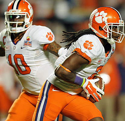
I prefer the all orange Clemson unis.
"My balls feels like they're in a French press." ~ bodysnatcher
-
darth_vedder
- Misplaced My Sponge
- Posts: 6467
- Joined: Tue January 01, 2013 9:52 pm
Re: Lament's Uniform Aesthetics Thread...
Those are sweet. I do like purple, but I'm not big on the all purple look. Purple on White is nice and the reverse is nice, but all purple is a bit much for me. I really like this combo for them:BigRedLedbetter wrote:darth_vedder wrote:Oh man, I love purple. I guess you really hate these then:doug rr wrote:I've been a rockies fan since day one but I have never bought any merchandise because I hate purple
- Spoiler: show
I prefer the all orange Clemson unis.
- Spoiler: show
-
BigRedLedbetter
- Rank This Poster
- Posts: 5401
- Joined: Sat June 07, 2014 5:38 pm
- Location: The town of Lincoln, Nebraska
Re: Lament's Uniform Aesthetics Thread...
darth_vedder wrote:Those are sweet. I do like purple, but I'm not big on the all purple look. Purple on White is nice and the reverse is nice, but all purple is a bit much for me. I really like this combo for them:BigRedLedbetter wrote:darth_vedder wrote:Oh man, I love purple. I guess you really hate these then:doug rr wrote:I've been a rockies fan since day one but I have never bought any merchandise because I hate purple
- Spoiler: show
I prefer the all orange Clemson unis.
- Spoiler: show
Indeed. I love the decals on the back. I wish the Huskers did something like that.
"My balls feels like they're in a French press." ~ bodysnatcher
-
spike

- The Master
- Posts: 36282
- Joined: Wed January 02, 2013 4:18 am
Re: Lament's Uniform Aesthetics Thread...
that guy looks like he should be in the new suicide squad movieLament wrote:I agree.Iholdthepain wrote:That has to be one of the worst! The colors don't match at all, it's like they took half of two completely different uniforms and have sewn them together. Kinda reminds me of those SF Giants/Oakland A's caps from the 1989 World Series...Lament wrote:Fine. But I refuse to leave out my alma mater...
I know it's the state flag, but it's a terrible look!
I do think with better execution there's an idea there worth pursuing, but I think they botched it pretty badly on that one. The pattern on the shoulder shouldn't be the same as the pattern on the corresponding side of the helmet. They should be flipped, like the flag. Or the helmet should just be one solid color. And it looks better on a black jersey, which they later did.


-
verb_to_trust

- Gone
- Posts: 24014
- Joined: Tue January 01, 2013 10:53 pm
- Location: Illinois
-
Lament

- Commissioner
- Posts: 11792
- Joined: Wed March 13, 2013 12:48 am
Re: Lament's Uniform Aesthetics Thread...
Yeah, Pirates-Dodgers was a good looking matchup tonight.
TEAM HARMLESS FOREVER...
-
darth_vedder
- Misplaced My Sponge
- Posts: 6467
- Joined: Tue January 01, 2013 9:52 pm
Re: Lament's Uniform Aesthetics Thread...
Thought this could just go here...
https://www.washingtonpost.com/news/dc- ... rm-policy/
Basically, it's just going over how strict the NFL uniform policy is.
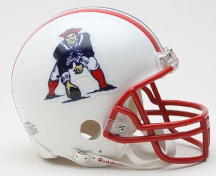
The thing I hate most is the helmet rule, where players have to wear the same helmet all season (something like that). Therefore, all the throwback helmets are against the rules. So as long as this rule is in place, we wont see these beauties:


https://www.washingtonpost.com/news/dc- ... rm-policy/
Basically, it's just going over how strict the NFL uniform policy is.
The thing I hate most is the helmet rule, where players have to wear the same helmet all season (something like that). Therefore, all the throwback helmets are against the rules. So as long as this rule is in place, we wont see these beauties:
-
darth_vedder
- Misplaced My Sponge
- Posts: 6467
- Joined: Tue January 01, 2013 9:52 pm
Re: Lament's Uniform Aesthetics Thread...
Can you guess the college football uniforms in black & white? I got 90%
http://collegespun.com/college-spun-2/q ... -and-white
http://collegespun.com/college-spun-2/q ... -and-white
-
Green Habit

- Site Admin
- Posts: 6946
- Joined: Wed December 12, 2012 10:33 pm
Re: Lament's Uniform Aesthetics Thread...
I agree. Amazing that the league is too cheap to just "certify" a different set of helmets.darth_vedder wrote:The thing I hate most is the helmet rule, where players have to wear the same helmet all season (something like that). Therefore, all the throwback helmets are against the rules. So as long as this rule is in place, we wont see these beauties:
-
Monkey_Driven

- The Master
- Posts: 28207
- Joined: Wed January 02, 2013 3:36 pm
- Location: Mushroom Kingdom
Re: Lament's Uniform Aesthetics Thread...
100 percent! Some of them are pretty easy if you can see the conference patch.darth_vedder wrote:Can you guess the college football uniforms in black & white? I got 90%
http://collegespun.com/college-spun-2/q ... -and-white
-
Monkey_Driven
- The Master
- Posts: 28207
- Joined: Wed January 02, 2013 3:36 pm
- Location: Mushroom Kingdom
Re: Lament's Uniform Aesthetics Thread...
These are pretty bad. Certainly better than the abominations they wore last year though. I hated the years Nebraska wore white on white too.BigRedLedbetter wrote:I LOOOOVED these that we wore for the Wisconsin game in 2012!

-
Lament
- Commissioner
- Posts: 11792
- Joined: Wed March 13, 2013 12:48 am
Re: Lament's Uniform Aesthetics Thread...

Fucking love these beautiful throwbacks they're wearing today.
TEAM HARMLESS FOREVER...
-
Self

- Polluted
- Posts: 4682
- Joined: Tue January 01, 2013 10:27 am
- Location: PM me, I have everything.
Re: Lament's Uniform Aesthetics Thread...
Not sure if posted already...
- Spoiler: show

-
BigRedLedbetter
- Rank This Poster
- Posts: 5401
- Joined: Sat June 07, 2014 5:38 pm
- Location: The town of Lincoln, Nebraska
Re: Lament's Uniform Aesthetics Thread...
Nah I like those.Monkey_Driven wrote:These are pretty bad. Certainly better than the abominations they wore last year though. I hated the years Nebraska wore white on white too.BigRedLedbetter wrote:I LOOOOVED these that we wore for the Wisconsin game in 2012!
Yes the ones last year were awful.
These are really bad!

"My balls feels like they're in a French press." ~ bodysnatcher
-
BigRedLedbetter
- Rank This Poster
- Posts: 5401
- Joined: Sat June 07, 2014 5:38 pm
- Location: The town of Lincoln, Nebraska
Re: Lament's Uniform Aesthetics Thread...
One of the best! I have a Mike Modano one.Self wrote:Not sure if posted already...
- Spoiler: show
"My balls feels like they're in a French press." ~ bodysnatcher
-
Monkey_Driven
- The Master
- Posts: 28207
- Joined: Wed January 02, 2013 3:36 pm
- Location: Mushroom Kingdom
Re: Lament's Uniform Aesthetics Thread...
I happen to like that look. It is contemporary, but not complicated. Not my favorite combination of Mizzou's uniforms but still good. To each his own I guess.BigRedLedbetter wrote:Nah I like those.Monkey_Driven wrote:These are pretty bad. Certainly better than the abominations they wore last year though. I hated the years Nebraska wore white on white too.BigRedLedbetter wrote:I LOOOOVED these that we wore for the Wisconsin game in 2012!
Yes the ones last year were awful.
These are really bad!
-
BigRedLedbetter
- Rank This Poster
- Posts: 5401
- Joined: Sat June 07, 2014 5:38 pm
- Location: The town of Lincoln, Nebraska
Re: Lament's Uniform Aesthetics Thread...
Indeed.Monkey_Driven wrote:I happen to like that look. It is contemporary, but not complicated. Not my favorite combination of Mizzou's uniforms but still good. To each his own I guess.BigRedLedbetter wrote:Nah I like those.Monkey_Driven wrote:These are pretty bad. Certainly better than the abominations they wore last year though. I hated the years Nebraska wore white on white too.BigRedLedbetter wrote:I LOOOOVED these that we wore for the Wisconsin game in 2012!
Yes the ones last year were awful.
These are really bad!
The ones you wore in the Corby Jones era were good.

"My balls feels like they're in a French press." ~ bodysnatcher