bune wrote:wtf is up with Maine? White wall or something?
Longfellows
Re: Miscellaneous charts, graphs and maps
Posted: Fri March 22, 2019 6:53 pm
by BurtReynolds
Re: Miscellaneous charts, graphs and maps
Posted: Fri March 22, 2019 7:04 pm
by BurtReynolds
Re: Miscellaneous charts, graphs and maps
Posted: Fri March 22, 2019 7:55 pm
by Simple Torture
bune wrote:wtf is up with Maine? White wall or something?
I believe there's at least one county up there that does something funky with its electoral votes, like it splits them or something (dont @ me if I'm way off).
Re: Miscellaneous charts, graphs and maps
Posted: Sat March 23, 2019 4:30 pm
by Norah
bune wrote:wtf is up with Maine? White wall or something?
have you been to maine?
new england liberal really means southeastern new england liberal
once you go west of worcester or north of the merrimack river it's a different world
Re: Miscellaneous charts, graphs and maps
Posted: Tue March 26, 2019 12:12 am
by BurtReynolds
Re: Miscellaneous charts, graphs and maps
Posted: Fri March 29, 2019 1:05 pm
by McParadigm
Re: Miscellaneous charts, graphs and maps
Posted: Fri March 29, 2019 4:25 pm
by bune
That's great news for the incel motivational posters.
Re: Miscellaneous charts, graphs and maps
Posted: Fri March 29, 2019 4:53 pm
by McParadigm
Incel...motivational posters? What could those possibly be?
“When at first you don’t succeed...it’s over!”
Re: Miscellaneous charts, graphs and maps
Posted: Fri March 29, 2019 5:26 pm
by verb_to_trust
It means less kids hopefully. That and boomers dying could really help the rest of us.
Re: Miscellaneous charts, graphs and maps
Posted: Sat March 30, 2019 1:54 am
by BurtReynolds
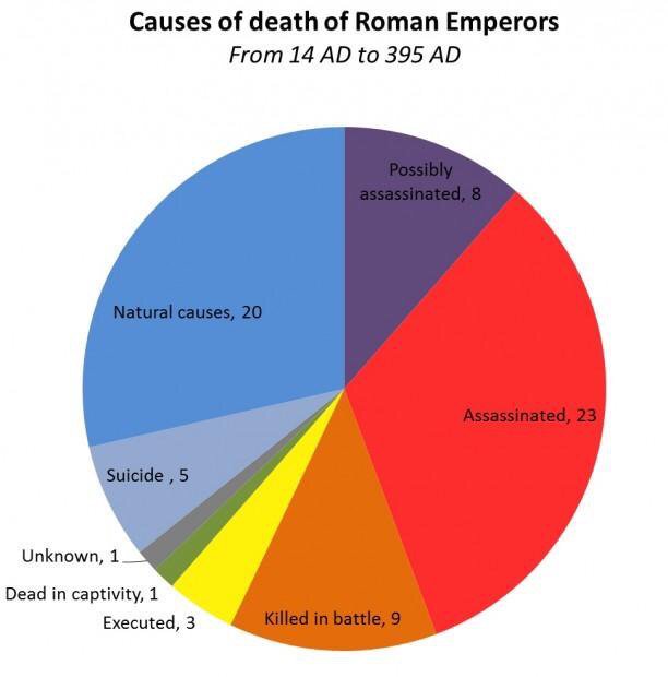
Unfortunately sex starved males tend to be a problem.
For example:
Re: Miscellaneous charts, graphs and maps
Posted: Sun March 31, 2019 10:35 pm
by BurtReynolds
Seems like a job you wouldn't want to have.
Re: Miscellaneous charts, graphs and maps
Posted: Wed April 10, 2019 3:05 am
by BurtReynolds
Re: Miscellaneous charts, graphs and maps
Posted: Wed April 10, 2019 8:19 am
by Citizen Dick
Units is my son's favorite color.
Re: Miscellaneous charts, graphs and maps
Posted: Thu April 11, 2019 4:47 am
by BurtReynolds
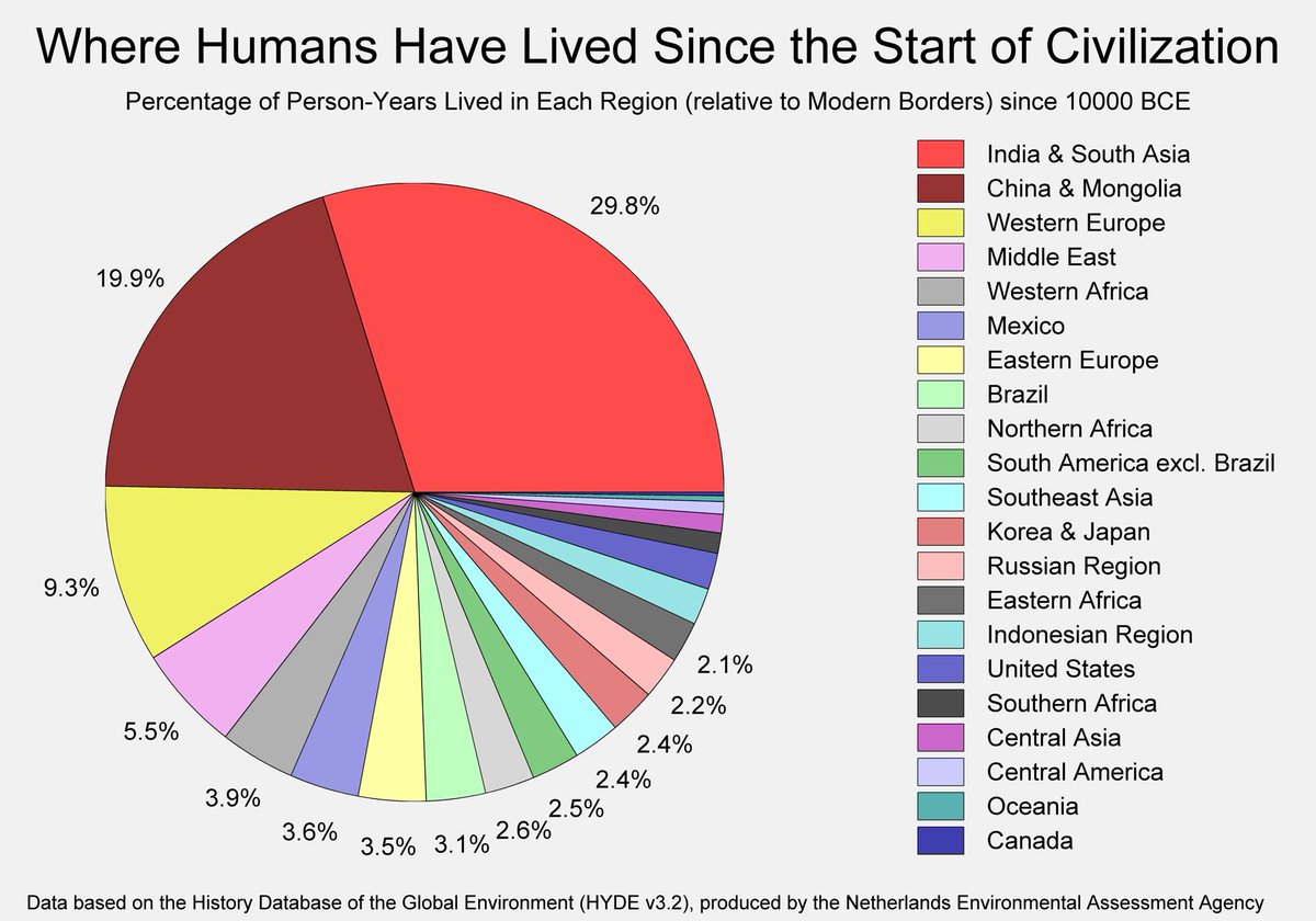
I watched all twenty minutes of this without being bored.
For all the tumult of the 20th century, it was just a blip on the radar compared to older events. This won't last.
Re: Miscellaneous charts, graphs and maps
Posted: Mon April 15, 2019 4:38 am
by bune
compared to insulin:
Re: Miscellaneous charts, graphs and maps
Posted: Mon April 15, 2019 7:10 am
by knee tunes
bune wrote:
compared to insulin:
~ ~ haha - - scribbles in the textbook - - asshole college kids ~ ~
Re: Miscellaneous charts, graphs and maps
Posted: Mon April 15, 2019 12:27 pm
by Green Habit
I feel like I need to see healthcare costs split out between what didn't exist X number of years ago and what did to get a better understanding of it. The further back one goes, the more I speculate that healthcare was cheaper because fewer treatments existed, and life expectancy was shorter.
College education costs, on the other hand....that I'm more convinced that there's a scam afoot.
Re: Miscellaneous charts, graphs and maps
Posted: Mon April 15, 2019 1:24 pm
by McParadigm
Green Habit wrote:I feel like I need to see healthcare costs split out between what didn't exist X number of years ago and what did to get a better understanding of it. The further back one goes, the more I speculate that healthcare was cheaper because fewer treatments existed, and life expectancy was shorter.
There’s certainly some significant cost involved in new technologies (an MRI machine costs $3 million to buy, $4 million to install/house, $100,000 a year to maintain, and can require on site salaried maintenance staff for larger hospitals).
Problem with this, though, is that US health care costs are anomalous among developed countries, but neither life expectancy nor range of treatments is better (or improving faster).
Re: Miscellaneous charts, graphs and maps
Posted: Mon April 15, 2019 1:35 pm
by Green Habit
McParadigm wrote:
Green Habit wrote:I feel like I need to see healthcare costs split out between what didn't exist X number of years ago and what did to get a better understanding of it. The further back one goes, the more I speculate that healthcare was cheaper because fewer treatments existed, and life expectancy was shorter.
There’s certainly some significant cost involved in new technologies (an MRI machine costs $3 million to buy, $4 million to install/house, $100,000 a year to maintain, and can require on site salaried maintenance staff for larger hospitals).
Problem with this, though, is that US health care costs are anomalous among developed countries, but neither life expectancy nor range of treatments is better (or improving faster).
This seems fair, I just see way too many people chalk it up to entirely one or the other.