Page 24 of 24
Re: Lament's Uniform Aesthetics Thread...
Posted: Sun July 07, 2019 10:52 pm
by Norah
Re: Lament's Uniform Aesthetics Thread...
Posted: Sun November 10, 2019 10:20 pm
by spike
Re: Lament's Uniform Aesthetics Thread...
Posted: Sun November 10, 2019 10:30 pm
by Norah
Looks like Pittsburgh, which is a compliment.
Re: Lament's Uniform Aesthetics Thread...
Posted: Sun November 10, 2019 10:43 pm
by spike
cool the original brown and yellow is back
Re: Lament's Uniform Aesthetics Thread...
Posted: Sun November 10, 2019 10:46 pm
by spike
also btw, sounds like the brewers are finally going back to the classic ball and mitt logo full time. it has been altered a bit:
Re: Lament's Uniform Aesthetics Thread...
Posted: Wed January 15, 2020 4:51 pm
by washing machine
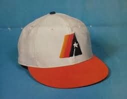
Prototype Astros logo replica cap.
This logo never saw the field of play.
It's the only way I can honestly express my sentiment towards the Astros this season. Still a fan of the local team in general, still a fan of baseball. Not a fan of anything associated with 2017 except for the memories I have of the moments.
Re: Lament's Uniform Aesthetics Thread...
Posted: Wed March 17, 2021 4:47 pm
by spike
These logo progression hats are terrible. Better in theory.
https://www.fanatics.com/mlb/milwaukee- ... 2525647861
Re: Lament's Uniform Aesthetics Thread...
Posted: Wed March 17, 2021 5:22 pm
by Bammer
Re: Lament's Uniform Aesthetics Thread...
Posted: Wed March 17, 2021 6:48 pm
by spike
Check out the Yankees one lol.
Re: Lament's Uniform Aesthetics Thread...
Posted: Wed May 26, 2021 2:35 pm
by spike
Re: Lament's Uniform Aesthetics Thread...
Posted: Fri May 28, 2021 3:09 am
by washing machine
That KC hat is snazzy.
They should have put a crawfish on the houston hat.
Re: Lament's Uniform Aesthetics Thread...
Posted: Fri May 28, 2021 5:41 am
by Bammer
Yikes
Re: Lament's Uniform Aesthetics Thread...
Posted: Fri May 28, 2021 3:23 pm
by Monkey_Driven
The Clippers/Mavs series is a matchup between two of the worse uni sets in the league.
Re: Lament's Uniform Aesthetics Thread...
Posted: Wed July 14, 2021 1:31 pm
by spike
Those AL unis last night were butt fucking ugly.
Re: Lament's Uniform Aesthetics Thread...
Posted: Mon July 26, 2021 6:10 pm
by Monkey_Driven
I'm officially at that stage of my life when I get really excited about my favorite team getting new uniforms.
Re: Lament's Uniform Aesthetics Thread...
Posted: Mon July 26, 2021 6:17 pm
by tree_
I'd give River's penis to have the Dolphins go with throwbacks permanently.
Re: Lament's Uniform Aesthetics Thread...
Posted: Mon July 26, 2021 10:34 pm
by Norah
what a weird thing to say
Re: Lament's Uniform Aesthetics Thread...
Posted: Sun August 01, 2021 7:15 pm
by Ensign9
This was not a valuable use of my time. I did it nonetheless.
Unofficial Uniform Czar Ratings
Jacksonville: B-. Change from black socks to teal socks.
Carolina: B. Ditch the white pants forever. Black or silver only.
Arizona: B. Road unis suck. Go all white jersey and all red pants.
Houston: C-. Boring color palette from the "every team must have dark blue or black in their colors) trend of the 2000s. Terrible team name. Regain rights to Oilers name and color scheme. If you need to factor in the damage the oil industry is doing to the environment, change the name to the Astros and change the derrick into a launchpad. If you must keep the current name and color palette, ditch the navy jerseys and stick with the red alternate.
Cleveland: A. Up until last season, these were an unmitigated disaster. Keep your current home and road unis and don't touch a thing. Light the orange numbers alternate on fire.
Indy: B*. They're not exactly exciting but I consider this to be their required design until the end of time. They are not allowed to change simply for tradition's sake. Get rid of home blue pants.
Chicago: A-. Same category as the Colts but they look better.
Atlanta: D. Go back to the Deion era black jersies and black helmet (albeit with newer Falcon logo). Red helmet alternate is fine.
Minnesota: B+. Not a bad redesign but I'm still partial to the 90s-era styling. Pants are not allowed to match jersey color.
San Fran: A+. Don't touch a thing on the home and away. Get rid of any and all alternate unis.
New Orleans: A. Gold pants only. No black pants allowed. Throwbacks with gold numbers look great.
Denver: D. See comments on Houston. Go back to orange crush unis and blue helmets immediately.
Tennessee: F. A total abomination. Come up with your own color scheme and return Oilers and original colors back to Houston.
New England: F as in "Fuck NE." Go back to red jerseys and white helmet unis. The Patriots will always be evil demons but that will get them to F+.
NY Giants B-: Road throwbacks look outstanding and should be default away uni albeit with the shinier gray pants. Home unis need to go back to 90s era. The Giants don't play in New York. Go back to the "GIANTS" log on helmet or change the 'y' to a 'J.'
Buffalo: A. They're very good and a welcome change from the navy blue era. Go back to red helmets immediately.
Cincinnati: C-. They're okay. Boomer-era unis look better. I'd give orange pants a go instead of white.
NY Jets: C+. Their throwbacks with the more muted green looked better. If you have to go back to the 90s-era unis, go all the way.
Washington: A-. Another team that should not be able to change their unis (aside from the racist logo and name). Pants and jersey color are not allowed to match. Yellow pants do look pretty good.
Miami: F. Go back to throwbacks immediately and it'd be an A+.
Detroit: B+. They're okay. Number font needs to be changed back to 90s-era style. Ditch the silver/grey alternate.
Tampa Bay: B. They're okay. Creamsicles are better.
Kansas City: A. Don't change a thing. Pants and jerseys not allowed to be same color.
Philly: C-. Go back to kelly green unis immediately.
Baltimore: C+. Purple top and black pants are acceptable.
LA Rams: F. Another abomination. Road jerseys look like they're soaked in sweat. Go back to 90s-era unis.
Oakland: A-. Another franchise that should not be allowed to evolve. Alternates with silver numbering look great.
Green Bay: A. Ditto.
Pittsburgh: A-. Ditto but change numbers back to more traditional style. Pencil-thin numbering, especially on that pervert Big Ben, look bad.
Seattle: B-. Neon green should be primary home color. Same color pants/jersey combos look bad.
LA Chargers: A. Get rid of the italics on the numbers and you're good to go.
Dallas: A. Not allowed to change (but I do recommend contracting them for crimes against humanity and/or Buffalo). Alternates look cheesy.
Re: Lament's Uniform Aesthetics Thread...
Posted: Sun August 30, 2026 1:07 am
by spike