Re: Movie: The Neon Demon (2016)
Posted: Fri May 20, 2016 6:27 pm
Dude, I'm with you on Drive. I think you might have even nailed it.durdencommatyler wrote:Oh. Well it isn't that either.Dev wrote:Guys, the category is Ver Good.
Dude, I'm with you on Drive. I think you might have even nailed it.durdencommatyler wrote:Oh. Well it isn't that either.Dev wrote:Guys, the category is Ver Good.
Dev wrote:Dude, I'm with you on Drive. I think you might have even nailed it.durdencommatyler wrote:Oh. Well it isn't that either.Dev wrote:Guys, the category is Ver Good.



It is a terrible font.E.H. Ruddock wrote:Even that font choice for the title pisses me off.
Don't be too hard on yourself, friend. You aren't a rube. He's clearly making choices, but those choices don't work for you. There's nothing to "get" or not get. You're not missing anything.E.H. Ruddock wrote:This may come across as stupid and rube-ish, but for me I think what bugged me was that he went out of his way to make the movie "edgy" and dark. I seem to even remember it being promoted that way. I don't know, I just didn't get it.

Hmm. I've always found it to be his sole warm film. Romantic, even. Sure, it's tempered by slick visuals and horror-inspired gore, but that's Refn.E.H. Ruddock wrote:This may come across as stupid and rube-ish, but for me I think what bugged me was that he went out of his way to make the movie "edgy" and dark. I seem to even remember it being promoted that way. I don't know, I just didn't get it.
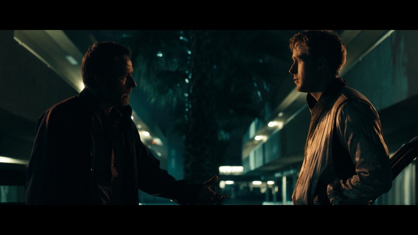
I'll give you that the cinematography doesn't exactly have great depth of field, but that's generally to be expected when it comes to digital. I do think, however, Refn and Newton Segel display a strong sense of color and framing. The aesthetic is very precise and coherent. The images may not have "depth" visually but they ooze atmosphere and character. They create a headspace both stylistically and for the protagonist.durdencommatyler wrote:The images are flat as shit, man. I don't know what to tell you. The tones are empty. There's virtually no depth. I'm not saying his composition is bad, though sometimes he goes to unnecessary places. Many of the ones you picked above are totally uninspired. The ones that have any decent depth or compelling movement or storytelling in them are shots that are recycled and fairly trite. That rearview mirror shot is interesting, has depth and dimension but Christ, how many times have we seen that shot in a movie?
And how does he make a sprawling cityscape look like bad video game cutaway? There's no life or sense of space in that shot at all. It's just flat. I guess I get a good sense of heat and rut from it. I'll give him that.
I don't disagree about a strong sense of color and framing. I don't agree with all the framing choices and some of them pulled me right out of the movie, but there is definitely a strong sense for those elements, absolutely. The aesthetic might be precise but it's also off putting. The movie does ooze atmosphere, that's one of the things it absolutely has going for it.LoathedVermin72 wrote:I'll give you that the cinematography doesn't exactly have great depth of field, but that's generally to be expected when it comes to digital. I do think, however, Refn and Newton Segel display a strong sense of color and framing. The aesthetic is very precise and coherent. The images may not have "depth" visually but they ooze atmosphere and character. They create a headspace both stylistically and for the protagonist.durdencommatyler wrote:The images are flat as shit, man. I don't know what to tell you. The tones are empty. There's virtually no depth. I'm not saying his composition is bad, though sometimes he goes to unnecessary places. Many of the ones you picked above are totally uninspired. The ones that have any decent depth or compelling movement or storytelling in them are shots that are recycled and fairly trite. That rearview mirror shot is interesting, has depth and dimension but Christ, how many times have we seen that shot in a movie?
And how does he make a sprawling cityscape look like bad video game cutaway? There's no life or sense of space in that shot at all. It's just flat. I guess I get a good sense of heat and rut from it. I'll give him that.
All right, I could see that. The movie actually does have a certain static nature to its images, which is something I like about it. It's very reserved, a bit distanced. Like its protagonist.durdencommatyler wrote:I don't disagree about a strong sense of color and framing. I don't agree with all the framing choices and some of them pulled me right out of the movie, but there is definitely a strong sense for those elements, absolutely. The aesthetic might be precise but it's also off putting. The movie does ooze atmosphere, that's one of the things it absolutely has going for it.LoathedVermin72 wrote:I'll give you that the cinematography doesn't exactly have great depth of field, but that's generally to be expected when it comes to digital. I do think, however, Refn and Newton Segel display a strong sense of color and framing. The aesthetic is very precise and coherent. The images may not have "depth" visually but they ooze atmosphere and character. They create a headspace both stylistically and for the protagonist.durdencommatyler wrote:The images are flat as shit, man. I don't know what to tell you. The tones are empty. There's virtually no depth. I'm not saying his composition is bad, though sometimes he goes to unnecessary places. Many of the ones you picked above are totally uninspired. The ones that have any decent depth or compelling movement or storytelling in them are shots that are recycled and fairly trite. That rearview mirror shot is interesting, has depth and dimension but Christ, how many times have we seen that shot in a movie?
And how does he make a sprawling cityscape look like bad video game cutaway? There's no life or sense of space in that shot at all. It's just flat. I guess I get a good sense of heat and rut from it. I'll give him that.
I'm glad you agree with me about visual depth. And that's what I meant by flat images. I'd be willing to drop "uninspired" but I'd trade it out with static.
And that's a good point. If that was intentional, then I'll give him a ton of credit for the choice. Even if it doesn't quite work on me for the whole movie, it's an interesting choice and an appropriate filter through which to experience the movie. This is why I try to be generous and not too hard on the film. There are good things about it. I just largely missed. And I hate seeing talent underused.LoathedVermin72 wrote:All right, I could see that. The movie actually does have a certain static nature to its images, which is something I like about it. It's very reserved, a bit distanced. Like its protagonist.durdencommatyler wrote:I don't disagree about a strong sense of color and framing. I don't agree with all the framing choices and some of them pulled me right out of the movie, but there is definitely a strong sense for those elements, absolutely. The aesthetic might be precise but it's also off putting. The movie does ooze atmosphere, that's one of the things it absolutely has going for it.LoathedVermin72 wrote:I'll give you that the cinematography doesn't exactly have great depth of field, but that's generally to be expected when it comes to digital. I do think, however, Refn and Newton Segel display a strong sense of color and framing. The aesthetic is very precise and coherent. The images may not have "depth" visually but they ooze atmosphere and character. They create a headspace both stylistically and for the protagonist.durdencommatyler wrote:The images are flat as shit, man. I don't know what to tell you. The tones are empty. There's virtually no depth. I'm not saying his composition is bad, though sometimes he goes to unnecessary places. Many of the ones you picked above are totally uninspired. The ones that have any decent depth or compelling movement or storytelling in them are shots that are recycled and fairly trite. That rearview mirror shot is interesting, has depth and dimension but Christ, how many times have we seen that shot in a movie?
And how does he make a sprawling cityscape look like bad video game cutaway? There's no life or sense of space in that shot at all. It's just flat. I guess I get a good sense of heat and rut from it. I'll give him that.
I'm glad you agree with me about visual depth. And that's what I meant by flat images. I'd be willing to drop "uninspired" but I'd trade it out with static.
no one asked you.Orpheus wrote:Loved Drive, did not enjoy Only God Forgives. But I've liked his other stuff a lot so I'll check this one out in the theater.